Branding identity
I was approached to create a branding identity for a new boba tea brand. The business was targeting younger audience and wanted a fresh, colourful and playful approach. The package of deliverables included a logo, colour palette, typography treatment, stickers, packaging and photography style.
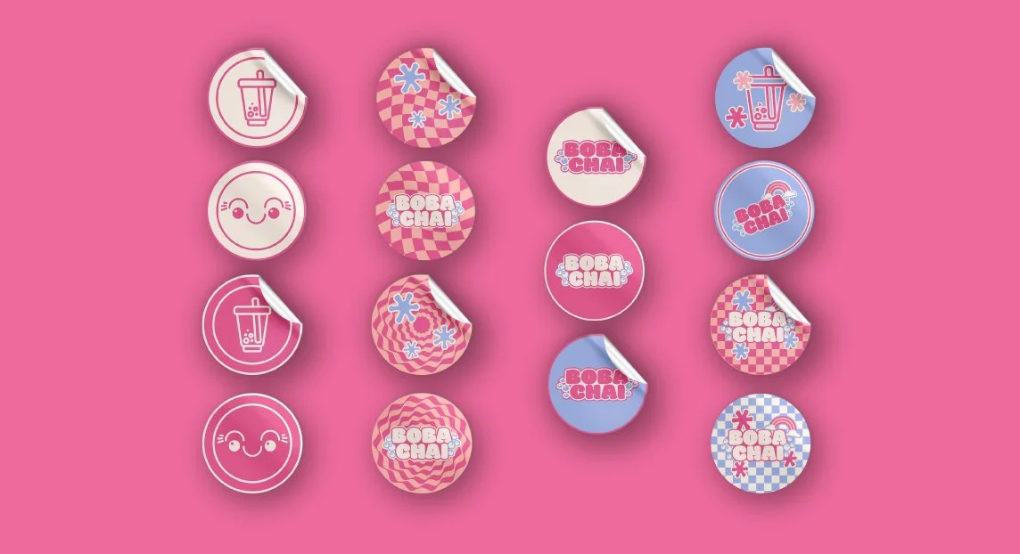
My first step was to create 3 creative concepts for the client to pick - cute and playful, bold and colourful and one which I called the strongly opinionated. I also made competitors audit consisting of research and comparison of already existing businesses in the niche and their branding treatment. The client really liked the first two concepts as well as certain graphics from my 3rd and next step for me was to develop the concept accordingly to the feedback. Since there were already 2 food businesses under the same company and they all needed to stand out - one had orange as main colour and the other - red. Warm colours are knows as appetising hence I chose warm shade of pink for the brand. It added nicely to their portfolio and boosted that cutesy youthful approach we were looking for. The third and last step for me was to amend minor elements and prepare for final sign off - artworking and files delivery.


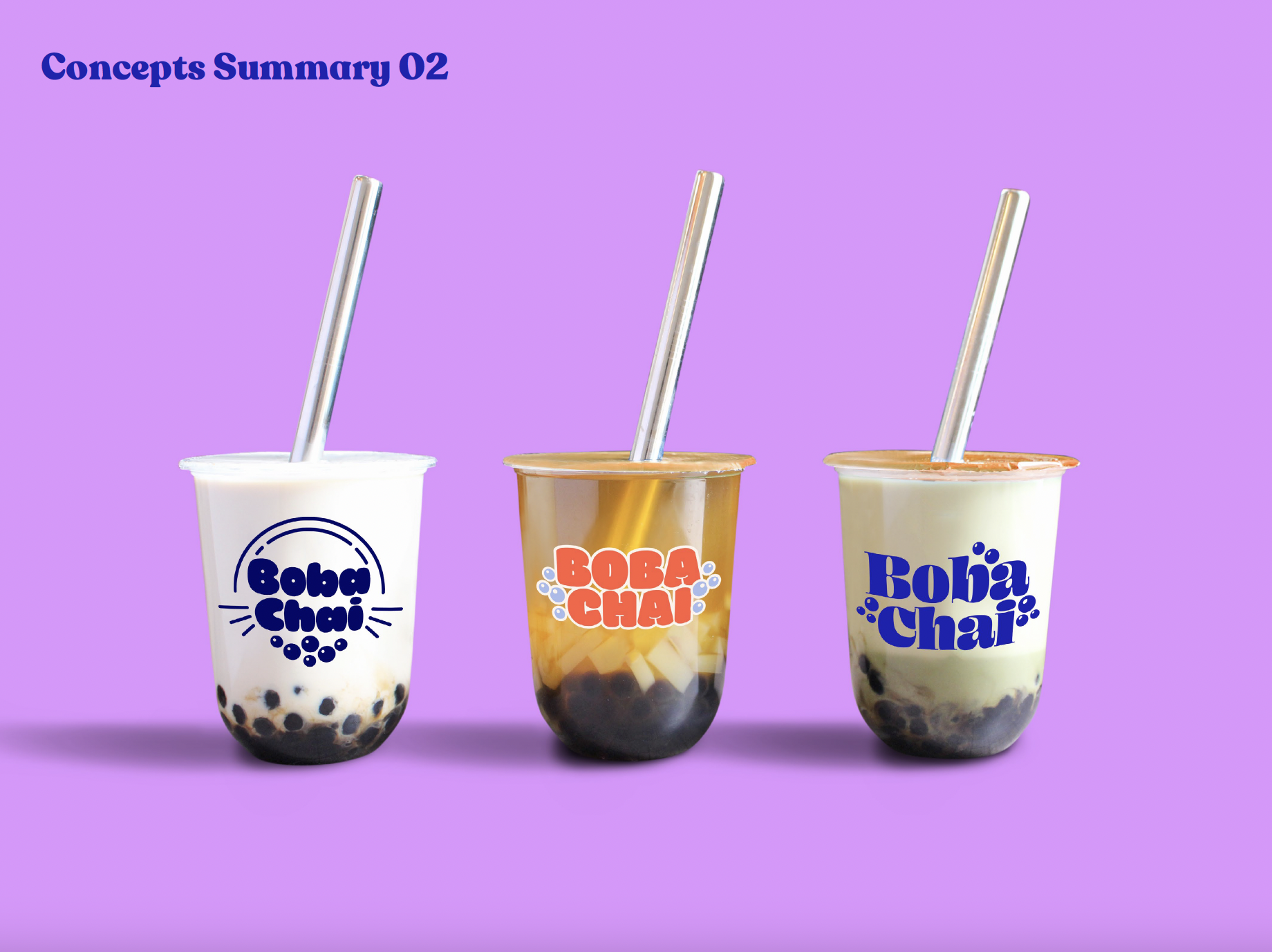
Creating a brand world would not be possible without placing the final product in a dedicated environment with mock-ups to show the design treatment. Our focus was packaging with the stickers being our first priority as well as the bags. I also created an extended logo and colour hierarchy plus three typography treatments and live use of branding in real time such as online ads for in app use (Deliveroo, Uber Eats).
Concept development

building the brand
When I started the drafting process I created one minimal two-colour option, one multicoloured, bold and explosive and one muted pastel theme. after every stage I made a presentation in which I demonstrate to the client how each concept would potentially develop, what’s it’s tone of voice and what more could be done with it in the future.